
Building something visual for the web is a balancing act that rarely gets talked about honestly. On one side you want images that look crisp on every screen and load fast enough that nobody bounces. On the other you want a design that works for the whole audience, not just the people who see color exactly the way you do. Both goals slip through the cracks constantly, not because designers do not care, but because the tools to check them used to be buried in expensive software or ignored entirely.
That has changed. A handful of free browser utilities now handle both concerns in seconds, no subscription required. This article walks through two of them that solve problems most creators do not realize they have until it is too late: converting graphics into a modern, lightweight format, and testing whether your color choices hold up for people with color vision deficiency. Together they cover a big slice of what separates amateur work from something that feels genuinely considered.
Why Image Format Still Decides Page Speed
Images are almost always the heaviest thing on a web page. Text is light, code is light, but a few oversized graphics can double your load time and quietly drive visitors away before your content ever appears. Search engines notice this too, and slow pages tend to rank worse. The single most effective thing many sites can do to speed up is simply serve their images in a smarter format at the right size.
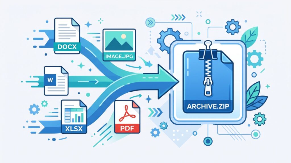
This is where newer formats earn their reputation. They compress far more efficiently than the older standards, delivering the same visual quality at a fraction of the file size. When you convert a scalable graphic into a compressed raster format, you get a file that renders fast and looks sharp. A quick pass through an SVG to WebP converter is often all it takes to turn a bulky asset into something lean enough for a performance-conscious page.
When Vector Meets Raster
Vector graphics are wonderful for logos and icons because they scale to any size without losing sharpness. But they are not always the right choice for delivery. Complex vector files with heavy detail can actually be larger and slower to render than a well-compressed raster image, and some contexts, like social sharing previews or certain email clients, simply do not support them. Converting to a raster format sidesteps those compatibility gaps entirely.
The trick is knowing when to make the switch. Keep vectors where you need infinite scalability and small file counts, such as UI icons. Convert to a compressed raster when you are shipping a fixed-size hero image, a thumbnail, or anything headed somewhere with spotty vector support. Making that call deliberately, rather than defaulting to one format for everything, is a small habit that pays off across an entire site.
The Audience You Cannot See
Roughly one in twelve men and one in two hundred women experience some form of color vision deficiency. That is a substantial portion of any audience, and most of them will never tell you when a design fails them. They just quietly struggle to read a red error message on a green background, or miss the difference between two chart lines you assumed were obviously distinct. The failure is invisible to the person who designed it, which is exactly what makes it dangerous.
The fix is to stop guessing and start checking. A color blindness simulator lets you view your design as someone with various types of color vision deficiency would see it, revealing in seconds where your palette breaks down. It is a humbling and genuinely useful experience the first time you watch a layout you were proud of turn into a muddle of indistinguishable tones.
Designing for Everyone, Not Just Most
The lesson these simulators teach is that color should never be the only thing carrying meaning. If the only way to tell “success” from “error” is green versus red, a portion of your audience is locked out. Pairing color with icons, labels, patterns, or position ensures the message survives no matter how someone perceives hue. This is not about dulling your palette. It is about adding redundancy so nothing important rests on color alone.
Contrast matters just as much. Even viewers with typical vision struggle with pale text on a bright background, and the problem compounds for everyone else. Running your interface through a simulator often exposes contrast weaknesses you had stopped noticing because you were too familiar with your own design. Fresh eyes, even simulated ones, catch what habit hides.
Building Accessibility Into the Workflow
The best time to check these things is early, while changes are cheap. Convert and optimize your images as you export them, and run your color scheme through a simulator before you commit to it, not after launch when fixes ripple through everything. Folding these quick checks into your normal process means they stop feeling like extra work and start feeling like part of exporting an asset, the same way you would never ship without a quick proofread.
Free browser tools make this realistic for solo creators and small teams who do not have a dedicated accessibility specialist. You do not need a big budget to serve fast images and inclusive color. You need the willingness to spend a few seconds checking, and the awareness that both problems exist in the first place. That awareness, more than any single tool, is what elevates the final result.
Key Takeaways
- Images are usually the heaviest part of a page, so format and size are the biggest levers for speed.
- Converting vectors to a compressed raster format solves both file-size and compatibility problems.
- Color vision deficiency affects a large share of any audience and is invisible to the designer who caused it.
- Never let color be the only carrier of meaning; pair it with icons, labels, or patterns.
- Check images and color early in your workflow, while corrections are still cheap and easy.
Small Checks, Better Work
The gap between good design and great design is often just a few overlooked checks. Optimizing an image so it loads instantly, and confirming a palette works for the full spectrum of human vision, are exactly the kind of quiet steps that separate polished work from the rest. Neither takes long, and both are free. When you are deciding which habits to build into your process, or handing a project to an experienced local team, the same standard applies: the details you check before launch are the ones your audience never has to complain about afterward.